In 2025, “good” does not mean “effective”. Users have become more demanding, conversions are more expensive, and attention spans are shorter. Therefore, design in advertising creatives should be not only visually appealing, but also strategically calculated.

What really works in creatives today? What visual approaches bring results? And why can template “banners with a button” become a thing of the past?
We have collected key trends and opinions on this matter.
“Ugly Ads” – why “ugly” creatives work
Less aesthetics – maximum meaning. Performance design has long ceased to be about aesthetics. The point is in the speed of perception and clear focus.
One of the strongest trends of recent years is ugly ads. And it has not only remained in 2025, but has become even more entrenched.
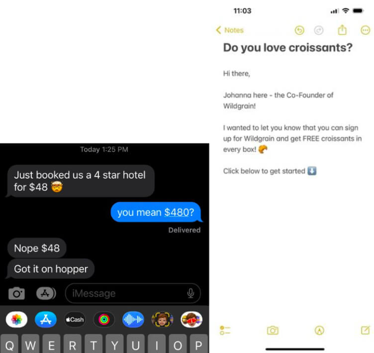
Today, most effective social media creatives don’t look like ads. They look like regular posts from insta or tweets from a friend: screenshots from notes, chats, with “random” emojis, etc. These are the formats that bring results because they do not cause the “advertising blindness” we are used to.
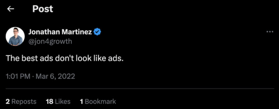
Barry Hott, a performance marketer who runs TikTok and regularly tests Meta ads, confirms this. In his articlehe writes:
“The best ads don’t always look good. In fact, the ‘ugly’ ones – with plain backgrounds, basic fonts, and raw images – often perform better. They feel real.”
💡 What he means is that too perfect a design looks “distant and far away”, while a simple, slightly less “licked” one inspires trust. The user does not see a polished ad, but a “live” presentation – and perceives it as more authentic.
📈 In his tests, a “flat” creative with Arial on a white background gives a higher CTR and lower CPA compared to a “well-mixed” creo with detailed stylization.
Creative as a mini-story
One of the reasons why “not perfect” works better is that it conveys the point faster and more honestly. In 2025, the most effective creatives work like mini-storytelling:
Even a banner or push can be a “story” if it has a sense of logic and structure.
If the user first thinks “what is this?” and a second later – “oh, this suits me”, then the creative is really working.
🎥Video creatives VS static
Moving creatives have taken over TikTok, Meta, and YouTube Shorts. But we’re not talking about studio productions – something similar to “shooting with your iPhone” is now ruling the roost.
Examples that work:
Today, motion-light wins:
Many marketers and designers admit in public discussions that simple videos assembled in CapCut or even in Instagram’s built-in editor often outperform creatives from professional productions.
The reason is speed, honesty, and nativeness. The user reacts better to “their own.”

🌀 Style mixes instead of banner thinking
Users have long been tired of typical banners: “before/after”, arrows, red buttons, identical templates. These approaches are devalued and do not evoke a reaction. In 2025, creatives who mix unexpected visual styles are much more likely to attract attention.
What it means:
This is not a combination for the sake of creativity, but a way to break the user’s expectations. When a visual looks different from what they’ve seen 100 times before, they become interested.
Such hybrid creatives are now being discussed among designers in the “X” in this trend, especially in the context of advertising for education, digital products and brands that want to “rebuild” the format of their communication.
🤖 AI is not a replacement, but an enhancement
AI has already become an integral part of creative development. Midjourney, Genmo, Runway help to generate images, backgrounds, and effects. But magic happens only in the mix with a human approach.
For example, we heard from friends that the team once launched 4 AI creos and 1 manual one. The manual one worked best, but AI helped to test hypotheses quickly and save time on ideas.
📱Adaptation to the platform is a must
What works on one platform dies on another. The visual approach should be changed depending on the context and behavior of the target audience on each of the channels, because there is a difference.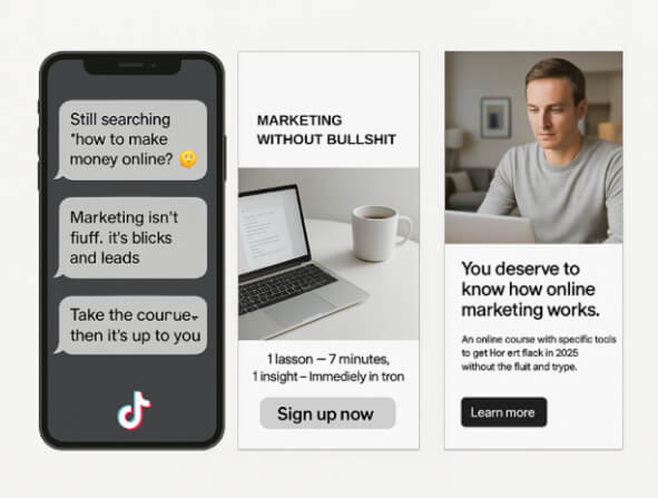
How to test the design
A/B tests are a mandatory part of working with creatives. But what exactly to test?
- the first 1-2 seconds of the video
- font, CTA, colors
- different formats for the platform
Tools:
- Meta Experiments
- Creatopy
- AdCreative.ai
- Google Optimize (for landing pages)
📎 Useful resources
To get inspired by trends and see what modern visuals look like, you should check out Dribbble. This way you can also find ideas that have already gone beyond the typical thinking.
Another must-see is the Midjourney Showcase. Here, you can see how AI aesthetics works: from surrealism to pseudo-photography, which are sometimes used as backgrounds or bases for creatives.
Also, pay attention toAdbrownie – it is a library of live creatives from real advertising. It collects videos and banners from TikTok, Meta, YouTube, etc., and allows you to see how brands present their products, what visual styles they use, what messages they insert in the first seconds, and what CTAs they repeat in several versions. The platform is convenient for trend analysis and inspiration before launching new campaigns.
Conclusions
The design of advertising creatives in 2025 is not about beauty for the sake of beauty. It is about the clarity of the message and the ability not to dissolve in the noise of the platform. Users respond much better to “imperfect” visuals, non-standard mixes of styles and formats that do not shout “I am an advertisement, buy this” but look lively, native and even a little strange.
AI has become not a replacement for a designer, but his “potion with a bonus”, as in The Witcher – if you know when and how to use it, you can become a level stronger. But the magic is still in your hands. Also, adaptation to a specific platform and constant testing is not just a good habit, but a must-have process, without which even the best creative will not reach a great result.