Don't miss interesting news

In the world of arbitrage and digital marketing, creatives make all the difference. One visual can take a campaign to the skies, while another can drain a budget to nothing. But it’s not just about colors or pictures. More and more often, designers talk about the tone of voice in the visual, the very “vibe” that the audience feels when they see an ad. It can be a serious presentation with graphs or a meme you send to a friend at two in the morning. And it’s this tone that determines whether people will stop at your creative.
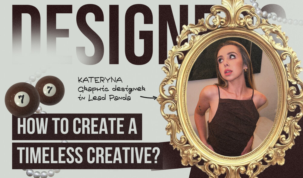
We talked to Kateryna, Leadpanda’s designer, about how she captures this tone and turns images into creatives that “take up space in the user’s head.” In this conversation, we’ll share honest insights on how to understand when a visual is burning out, when to change the plot, and when small edits are enough, what quick hacks refresh the creative, and how not to lose brand recognition.
Tone of voice in visuals is about the vibe. It’s not just about “what we show”, but “how it comes across to people”. The same idea can look like a strict business post with graphs, or like a meme you send to a friend at two in the morning.
To get the tone right, I always look at a few things:
As a result, the tone of voice in a visual is a mix of manner, mood, and context. If everything comes together, the creative ceases to be a “picture for advertising” and becomes understandable, lively, and “yours” for the people it is addressed to.
The first “bell” is that the audience’s reaction is getting weaker. If yesterday a post collected dozens of comments and saves, and today it’s only a few, it means that the creative has stopped catching on. There are fewer likes, reposts, and interactions, and the reach is also falling, because the algorithms see that the content is not interesting.
An indifferent “scroll by” appears – people don’t even stop at the picture, they just fly on. This can be seen in the dynamics of views and how much time they spend on the page after contacting the creative. If the interaction time decreases, users are simply bored.
CTR is the main indicator. If the percentage of clicks drops, it means that the visual no longer makes people want to click. People can see it, but it doesn’t inspire action.
Another important parameter is the frequency of impressions. If the same audience sees a creative more than 7-10 times, it automatically starts to “burn out.” People get tired of repetition and stop responding, even if the visual once worked well.
An equally important point is the relevance of the message and visuals.If a message or picture looks outdated, does not match the mood of the audience or trends, it ceases to evoke emotion. What was a hit a month ago may be perceived as “yesterday’s news.”
As a result, burnt-out creative can always be recognized by a combination of several signals: decreased engagement, user indifference, falling CTR, high impression frequency, and loss of relevance.
When a creative burns out, cosmetic changes are not enough. Simply repainting the background or changing the font won’t solve the problem. The audience is already accustomed to the image, it has ceased to evoke emotion.
What I do:
The point is that you need to refresh not only the “colors”, but also the sense, context, and feeling that the user gets from the creative.
Yes, and these are the little details that often save creatives when they don’t have time or resources for a full redesign. It’s important to remember that the audience responds not only to the image, but also to the tone, context, and even the slightest change in presentation. Therefore, there are some simple tricks that can be applied quickly, but the effect of them will be tangible.
All these “mini-redesigns” work quickly and do not require global changes. Their point is to refresh the tone and context, because the audience will get bored not so much with the image itself as with the feeling of repetition. If you give a new emphasis, a different mood, or a new emotion, even an old visual can sparkle in a new way.
It’s important to remember: updating your creative doesn’t mean completely abandoning your own identity. The audience “clings” to the established elements – the logo, colors, fonts, and general style. If you keep them, you can safely experiment with tone of voice and stories without losing the sense of brand integrity.
I use the rule 70/30:
If there is a complete redesign or rebranding, I am in favor of a transparent approach:
In fact, changing the tone of voice is not a leap into the unknown, but a gradual update through familiar brand markers. The user sees that the style is recognizable, but the presentation is fresh. This allows you to balance between stability and novelty.