Don't miss interesting news
Is corporate identity in creatives a must or an invention of designers who just want to “look like a portfolio?” Can it be done quickly and beautifully without losing identity? And how not to get burned when the client adjusts everything to his mood?
Read a frank conversation with a creative expert and learn how a recognizable style is born and why templates are not always evil, but our friend. And finally, what does a design that doesn’t work look like, even if it’s beautiful and the founder likes it.
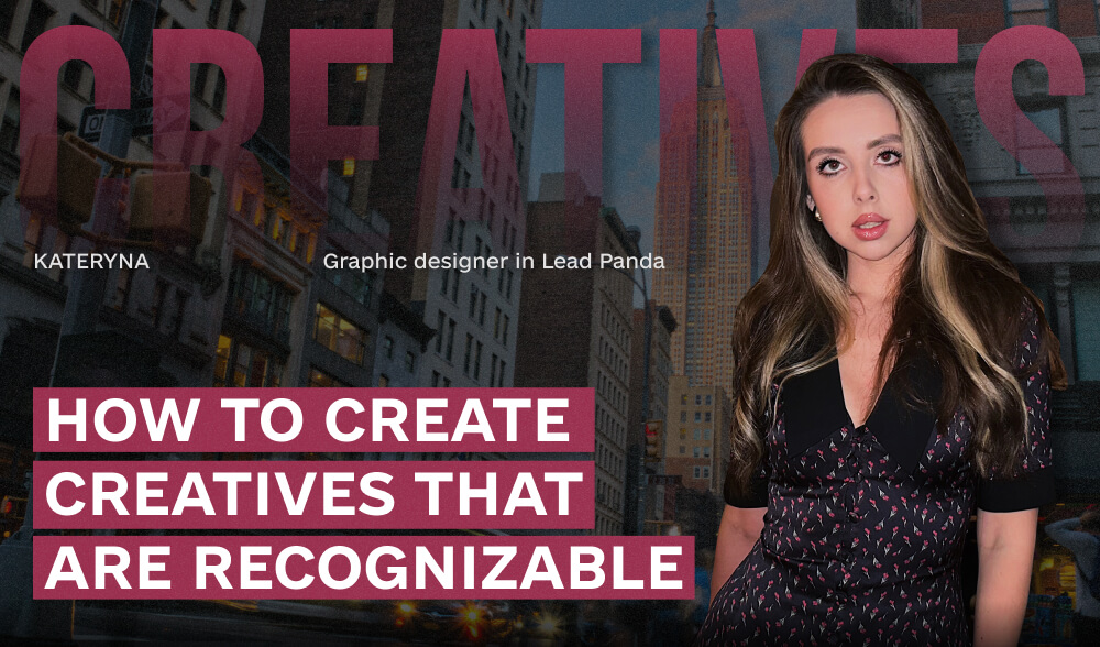
About this and even more in a conversation with our heroine – Kateryna, graphic designer at Lead Panda.
Of course, it does. Personally, I divide them into two options: the corporate identity of the company’s brand and the corporate identity of the designer himself.
With the first one, everything is clear – you follow the clear rules of the brand book: sometimes they are very specific, sometimes they are more generalized and give you more freedom. Everything in it is in the same style: brand elements, colors, fonts.
But the second option is more interesting – each designer has his or her own style of presentation, and many can be recognized by it. This is evident in projects, personal works, or social media, where there was no need to adapt to any rules at first.
Yes, designers often have to remove their “I” from a project because they need to. How do we understand this? By the goal achieved. And the goal of design is to attract attention, clearly convey information, be remembered, and create an emotional connection.
If the goal is achieved, there is a response and a result, then the design works. Of course, before that, an analysis is carried out: innovations in the niche, competitors, audience, etc. We determine the relevance, the way of conveying the values of the brand or company, and form an idea.
If you choose one thing, then, of course, recognition.
A brand should create a special image in the audience’s mind – thanks to its inherent characteristics, attributes and associations. Design helps to establish a visual language of communication between the brand and the client. Roughly speaking, the “base” should immerse the audience in the atmosphere of brand values and authenticity, gradually telling details that are ALWAYS connected to each other – this is why clear rules are created.
And then, within this system, you can and even SHOULD situationally introduce trends – in creatives, information occasions, such as holidays, events, collaborations, etc. It all depends on the niche: someone can afford to deviate more from the identity, while others cannot.
The rules make it easier to “do it quickly”: you don’t have to look for fonts again, you don’t have to figure out where to put text and where to put images.
And also, since I am a creative person and often depend on my mood, it is easier for me when there are mini-billets, templates – you do not start from scratch, but most often just adapt.
For me, the most difficult thing is to come up with a style. This is a really laborious process that consists of a dozen separate tasks and also requires deep marketing knowledge, experience, and orientation in the niche and among competitors.
Next is the search for ideas for specific creatives – on request and with the competent implementation of these ideas.
This is my painful topic. I will say this: the client is not always right, and even if he knows the brand from the inside, it does not mean that “he knows better”, because very often the owner is not the target audience of the brand. And such a thing as “like/dislike” is quite subjective. I’m not saying it’s the case with everyone, but such cases have happened.
How did you get out of the situation? At first, of course, you present it and explain why it’s the way it is. Then the edits come in, and you realize that it’s “not there” at all. Then you explain why it won’t work, give arguments and examples, and either they hear you or they don’t. And if, after long discussions, you are still not heard, you eventually agree, do as you are asked, and quietly bring it out at least in some kind of presentable picture.
All designers have probably had such projects, especially at the beginning of their career, when you don’t have to choose among dozens of orders and aren’t always ready to argue with the client. But you gain experience.
Probably the most important faux pas is monotony where there is actually room for creativity. You need to be able to keep a balance between a recognizable identity and appropriate creativity and trends.
Templates are good, but you also need to be able to work with them: to change them situationally depending on the context.
Chaotic, lack of logic and a holistic brand picture. Unnecessary details that reduce the perception of meaning when there is no answer to the question “why is this here?”
And most importantly, the lack of audience reaction when the design does not evoke any emotions.
As you can see, corporate identity is not about the framework, but about the direction. It does not limit, but gives support. It helps not to get lost in edits, not to start from scratch every time, not to lose yourself in projects.
Kateryna honestly told us how to keep a balance between the template and creativity, between the client’s vision and the reality of the market. And she reminded us once again: even the most beautiful design is worthless if it doesn’t work.
So create beautifully, but meaningfully. And remember: a good style is the one that lives longer than a trend.