Don't miss interesting news
What is the Mobile-first approach and why does every business need it?

In the modern world, a mobile phone is an integral part of our lives. Today, more than 50% of all Internet traffic is generated by smartphones. Optimizing a website for different types of devices has long been one of the mandatory points in the development specification. And today you can hear more and more often about the Mobile First approach.
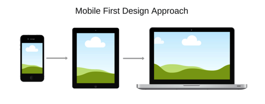
The Mobile First strategy involves designing a mobile-friendly website interface. The philosophy of the approach is that first a design prototype is created for the smallest screen, and then developers move on to larger displays. This is the main difference from the classic Desktop First approach, which has been used by web specialists for many years.
Please note! For example, the desktop version of a website is viewed by users for an average of 5 minutes and 5 seconds. But when visiting from a mobile device, it takes only 3 minutes and 32 seconds.
The first and most important thing is fast page loading. One or two seconds is how long most people are willing to wait for the so-called “first contentful paint” (FCP). Even if a user is interested in the page description in the search results, there is a risk that he or she will leave a site that takes a long time to load.
“According to our research, if a page takes more than 3 seconds to load, the probability of bouncing increases by 32%, and if it takes more than 5 seconds, it increases by 90%,” says Daniel Ahn, Global Product Manager at Google.
Forget about small fonts and cropped images. When developing a mobile-friendly UX website, priority is given to the convenience of actions on a small screen. Continuously increasing customer conversion and retention is something that every company cares about. According to statistics, if a website is not optimized for mobile, its traffic is 50% lower, even if users are loyal to the product or content.
Mobile traffic is growing steadily, so Mobile First Design will allow Internet companies to increase the reach of their target audience through high-quality website optimization for mobile use.
Mobile First Design makes it easier to collect useful data about customers and their behavior, allowing you to analyze it more deeply and develop more effective strategies.

Digitalization and globalization are only increasing every year. We are going to face a lot of changes in website promotion and ranking. The first step has already been taken. However, the real revolution is still ahead. Will mobile phones replace the desktop shortly? Write your thoughts in the comments!