Don't miss interesting news

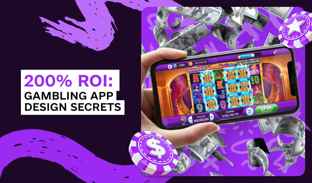
Do you want to make 200% ROI from the start, without any unnecessary experiments? The cover design, icon, title – all of these directly affect the conversion rate (CR%) of your email. But let’s take it step by step!
The first contact a user has with an app in the App Store is a key moment that determines the success of your advertising campaign. All the details are important: stylish design, bright colors, elements that “heat up” interest in downloading and making the first deposit (FTD). Will the user download the application? Will he deposit money? Will he leave it after that?
And now for more details…
The visual impression of your app is the first thing that catches the user’s eye. And this first impression should be not just attractive, but exciting and inspiring. The main task of design is to convey the atmosphere of excitement, thrill, and anticipation of winning at first sight. This is what makes users not only look at your app but want to download it.
Vibrant, rich colors, such as gold, red, or lush green, can instantly attract the eye and evoke strong emotions. Gold personifies wealth and luxury, red energizes and awakens excitement, and green is associated with money and good luck. These colors create the right atmosphere of opportunities and winnings. However, it is important that they are harmoniously combined with the main colors of your setting or offer.
From the point of view of psychology, bright colors “speak” to the subconscious, pushing to action. For example, gold is about success and wealth, which literally scream about big wins and happy luxury. Red color adds drive, evoking a sense of risk and excitement, and green evokes thoughts of stability and fortune.
Your design should be in harmony with the overall style of the app, and the chosen colors should create a positive emotional background, encouraging the user to stay and take action.

Associative elements in game worlds are a real attention magnet. When players notice something familiar – for example, mascots like in Gates of Olympus or Big Bass Bonanza, or distinctive symbols like a sugar bomb in Sweet Bonanza or a book in Book of Dead – it immediately evokes vivid associations. Such details become visual anchors that remind us of a pleasant experience and arouse interest in new content. They not only add magnetism, but also create a sense of reliability and quality, especially when associated with popular games.
That is why it is important to pay attention to such recognizable elements in specific slots or offers.

To add emotional drive, coins, treasures, sparks, or shine symbolize wealth and success. They hint at big wins and achievements, which attracts players who crave excitement and opportunities to win.
The app and its cover should immediately evoke positive emotions.

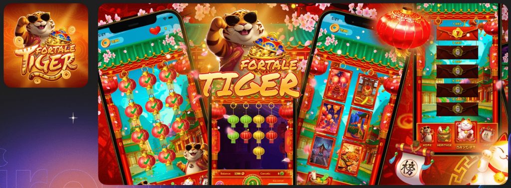
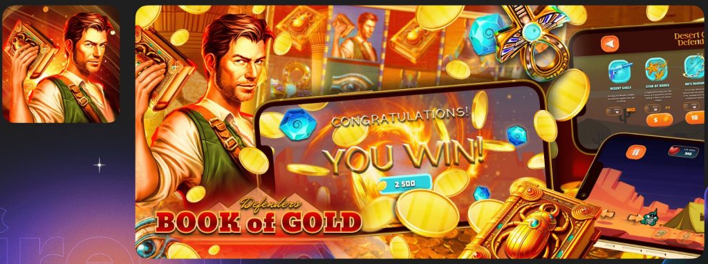
The design of each element of the cap is adapted to a specific slot. Everything is taken into account: the way the playing field looks, the visualization of big wins, and the demonstration of moments with bonus games. This creates a feeling of excitement and anticipation of success in users, which motivates them to act.
According to the App Store rules, banners should show screenshots from a real application. And for good reason: statistics show that Apple generates more revenue from the App Store than Google does from Google Play. This is because users trust Apple more because of its high quality standards.
If a person sees familiar game elements on a banner, similar to a slot, he or she is more likely to download the app. Therefore, vivid screenshots with a playing field, big wins, or bonuses can be a decisive factor in making a decision.
It is important to pay attention to whether there is something directly associated with slots or gambling on the plug. It can be fields with game elements, a screen with a big win, a wheel of fortune, or a welcome bonus. Abstract design looks good, but if you add aggressive elements that directly indicate gambling, the conversion rate will increase significantly.
In app stores, it is quite rare to find stubs with openly gambling overtones. However, elements that resemble a slot playing field or a wheel of fortune, for example, from Crazy Time, can strongly influence the user’s perception.
Design with clear references to gambling is the key to maximizing audience engagement.
Design in a gambling app is an important component of the success of your advertising. If you use visual elements correctly, you can not only attract the attention of users but also encourage them to stay longer, engage in the process, and ultimately increase conversion.
It’s important to understand that design is not just about the look of the app itself. It covers everything from creatives to pre-landscapes and other advertising tools. A cool design is able to touch emotions, cause excitement, and create a “wow effect”. For example, it is useful to use images of real people who enjoy casino winnings in motion creatives. This helps to create a strong emotional connection with the audience and enhances the impression of the offer.
So don’t forget: design is not just pictures, but a powerful tool that can make your campaign really successful.