Ten dates without a spark is painful, but you have to keep going. And honestly, the problem is not in the font. The problem is in the message with which people are addressed, and in the fact that they are speaking to the “wrong people” or in the wrong way.
This is a text for those who have spinning impressions but no action. The goal is simple: learn how to change your tone and delivery so that the right eyes finally respond.
What is “tone in visuals”
Tone is not “what font to use”, although the font also plays a role in perception. But it is a way of conveying an idea: calmly or persistently, with humor or business, “leading by the hand” or “pressing in the forehead”. The manner of the text is created by the headline, body text, CTA, color, composition, rhythm of frames, and the first screen. If the first thing a person sees is a logo and a “buy” request, it’s unlikely to happen.
Three quick diagnostics before changes
Before you break something, check where it hurts.
Repeating the message: people see the same wording over and over again and are tired of it.
“Signs of advertising”: the layout is read by the brain as a typical ad form and becomes invisible or immediately annoying.
Frequency without meaning: more impressions, but less interaction – so you’re burned out, not “let’s not add more budget.”
Why universal playbooks don’t work
Standard platform scripts are the average temperature in the room. They don’t hit a specific person with their language, habits, and pains well. When they address “everyone,” they are not really talking to anyone. A personalized tone for your audience should always win over a universal presentation.
How to learn the tone of your audience
To hit the top ten, you need to hear your audience and understand them.
Describe situations, not just demographics: “saving”, “postponing”, “ready to try”, “looking for proof”, and this will give you new ideas for content to address these issues.
Record the “stop” triggers: what irritates and turns on the defense (pathos, pressure, pitying intonations, “only today”), for this you can choose a test group to evaluate the creo, but it can also be understood by KPIs.
Find the “go” triggers: what relieves tension (fair conditions, a clear path of “what’s next,” a short instruction instead of a flaming slogan).
Translate into their language: there should be a “dictionary” of the audience with successful words that work well and are relevant, the pace and examples from the real life of this person should be taken into account.
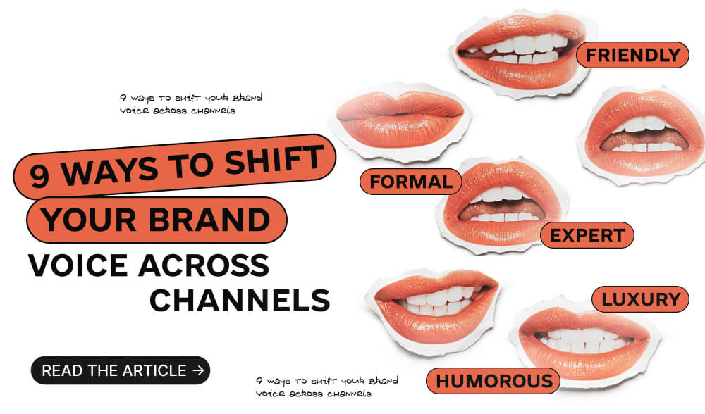
9 ways to change the tone of voice in a visual after 10+ impressions
- Shift the emphasis from “just begging for attention” to “offering value now, expecting attention”
Answer one real question in the headline and show the result right away. Less “generalizations” and more “this is how you can do it.” - Down the volume, up the clarity
Take away the excess in creo, give air, make 5-7 words in large font and one object/gesture in focus. When it’s easy for the eyes, the meaning comes faster. - Flip the perspective
Not “watch this”, but “see how it works in your situation”. Show the reality, the process, the before/after – not the perfect people from stock photos. - Tell the story in parts, using storytelling
Instead of repeating the same thing, unfold the story in a mini-series: fact → demonstration → proof → simple action. Each creative is a new meaning, not just a new background. - Divide tones into segments
If a person’s pain is to save money, then a calm tone and specific benefits can work. “Postponing” is a risk-free attempt to test something without losing anything. “Already ready” – to show a shortcut to action. Each segment has its own vocabulary and permissible frequency. - Remove the “signs of advertising”
Fewer frames, “-50% today” badges, microfonts, and stock smiles. More native and context: where, when and how it is used. - The first frame is the answer
Start the video with the result or key benefit, not the logo. The first 2-3 seconds decide whether they will see anything at all. - Respect for the time and place
Don’t launch loud promos on days of mourning, during acute events in the city/region. It is better to pause or change the tone to supportive and helpful. - Operational update system
Have a refresh calendar, soft frequency limits for segments, and a ready-made library of tones: calm, ironic, formal, etc. Switch by metrics, not inspiration, although it’s always good to test new creative ideas.
Scenarios for different platforms
The feed has large, readable text, one focus, and a minimum of noise. Stories have a hook in the first frame and a “how-to” answer in 2-3 screens.
Live voice, minimum staging, maximum benefit/emotion here and now. Not a “promotion” but a “demo/life hack”. The first seconds are the point, not the intro.
A calm professional tone or a mini-story. The title and preview should answer the request, not play clickbait. The first 5 seconds are an insight or a demonstration.
Business, specific language: fact, conclusion, action. Visuals are clean, without decorative noise. A 60-second case study is better than a six-minute “novel”.
Anti-banner features: simple background, one benefit, one action, readability at a glance. Native placements and atypical compositions are better than “banner in a banner corner.”
How to understand that the tone has worked
Look at the early signals of attention: retention of the first seconds, visibility, depth of interaction. If they grow at the same frequency and CTR stabilizes, then the tone has hit the mark. If not, change the segment presentation, not just the details.
Final
The tenth meeting is also a chance. People don’t lack taste, they lack the feeling that they are being spoken to in a real way and for them. Give benefit, speak their language, break the story down into “chapters” instead of chasing universality – and clicks will find you, samurai.