Don't miss interesting news

Microsoft Clarity is a free tool for analyzing visitor behavior on a website. Its script is easy to add to any landing page, and in a few minutes Clarity will start collecting data automatically: heatmaps of clicks and page scrolls, as well as recording video sessions of real visitors. This allows you not only to look at the numbers, but also to see where people click and how they scroll. According to affiliate marketing experts, tools like Clarity help to “identify points of conversion loss” that are invisible in conventional statistics. In other words, the analysis with Clarity gives you an almost complete picture: you will see at what stages users stop or leave, and what they are really interested in and what they are not.
The material was prepared by the authors of the ConvertX project. You can find more information like this in our Telegram channels – for juniors, middles,Seniors and C-lvl.
Also, you can buy .com domains with history at a good price from us.
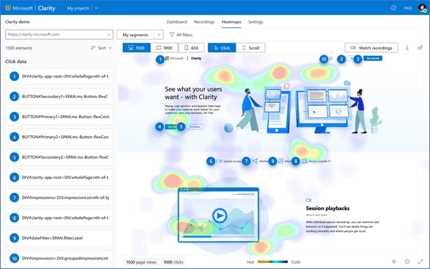
Clarity automatically builds heat maps that show how far vertically visitors reach.
In the above example (scrollmap), you can see that only ~20% of people reach the bottom – most stop much higher, about 75% of the page height. This means that the bottom of the page is “unobvious” or uninteresting. As recommended by the Clarity blog, we can look for typical drop-off points and move the lost important blocks higher. That is, if 80% of users “lose interest” at the top of the page, it is worth moving the main key offers and calls to action closer to the top to avoid losing the audience.
Above the scroll heatmap, it’s useful to use session replays. Clarity records visitors’ on-screen sessions and plays them back for analysis. This allows you to literally “watch” the user’s path through the landing page: where they stay, what they interact with, and where they leave.
For example, we can see that most users enter the subscription form but do not click “Submit” – perhaps the form is too complicated or unclear. As described in Clarity’s documentation, the records show exactly the moments when a lead hesitates: whether it’s a long pause or a search attempt, and at what point a person leaves the page. Knowing this, you can change a specific block: simplify the text, add tips, shorten the form, or remove distracting elements.
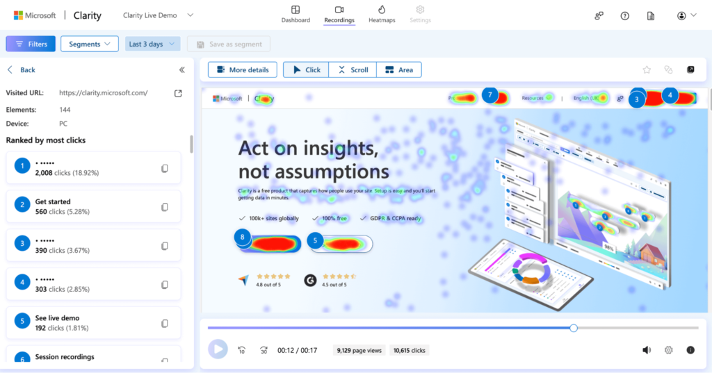
Click maps in Clarity show which elements of the landing page users click on most often. The picture above shows a typical example – a lot of clicks go to navigation and side links, not the main CTA button. With this in mind, we adjust the design: move the “Buy” or “Get Bonus” call to the most active area of the page, change the color of the button or the text to make it more visible. For example, if the map shows that users concentrate their attention in the top third of the page, we place the key CTA there. Small changes – a brighter button color, a shorter headline, different text – often result in a big increase in conversions.
Thus, Clarity gives us a clear picture of the “wastage” on the page. Now we need to act: eliminate obstacles and strengthen the strengths of the landing page. If analytics have shown that users ignore a long paragraph of text with terms, simplify it or put the main thing in bullet points. If an important block (reviews, guarantees, promotions) is too low, raise it higher. If the recording of sessions shows misunderstandings on the form, redesign it with UX in mind. Don’t forget about A/B testing: change one element and compare the result. As the guide advises, you can “use Clarity to test different layouts, placements, colors, and texts and see which one gives you the best CR.” If you have a different version of a button or a headline on your landing page, run Clarity and see which one is more clickable.

Microsoft Clarity is an extremely useful tool for arbitrators, as it minimizes guesswork and turns it into data. Every click, scroll, or hesitation of the user becomes a signal that leads to optimization. The main thing is to use these insights systematically: collect data, find “drop-off points” and errors, make changes, and measure the results again. It is this cyclical approach (analysis – action – verification) that takes landing page conversion to a new level. Use Clarity as one of the main “assistants” in landing page optimization – it’s a free way to increase CR and improve campaign performance.
The material was prepared by the authors of the ConvertX project. You can find more information like this in our Telegram channels – for juniors, middles, Seniors and C-lvl.
Also, you can buy .com domains with history at a good price.