UX in creatives: why the user experience starts before the ad click

UX in creatives: why the user experience starts before the ad click
0
286
9min.

UX design in advertising is like a secret ingredient in McDonald’s: everyone seems to know that it tastes good, but not everyone understands how to achieve it. Meanwhile, creatives with the right UX generate 3-5 times more conversions than the usual “beautiful picture with text.”

If you still think that ux is only for websites, and advertising is just bright banners, then this article will change your mind about advertising creatives. After all, a modern user sees up to 10,000 advertising messages a day, and will pay attention only to those that “reach out” to his or her needs.

UX in creatives: why the user experience starts before the ad click

What is UX in advertising creatives in simple words

UX in creatives is when your targeted ads don’t annoy the user, but become part of their natural experience on the Internet. Just imagine: a person is scrolling through social media, looking for something interesting, and suddenly sees your ad. If it organically fits into the feed, clearly explains the benefits and does not make you strain, this is the right UX.

Creatives are not just bright pictures. This is a thoughtful tool that:

Takes into account the context where a person will see the ad;
Adapts to the mood of the target audience;
Uses familiar visual patterns of the platform;
Leads the user to action in a natural way.

Why good UX in creatives is a necessity

Numbers that don’t let you sleep well

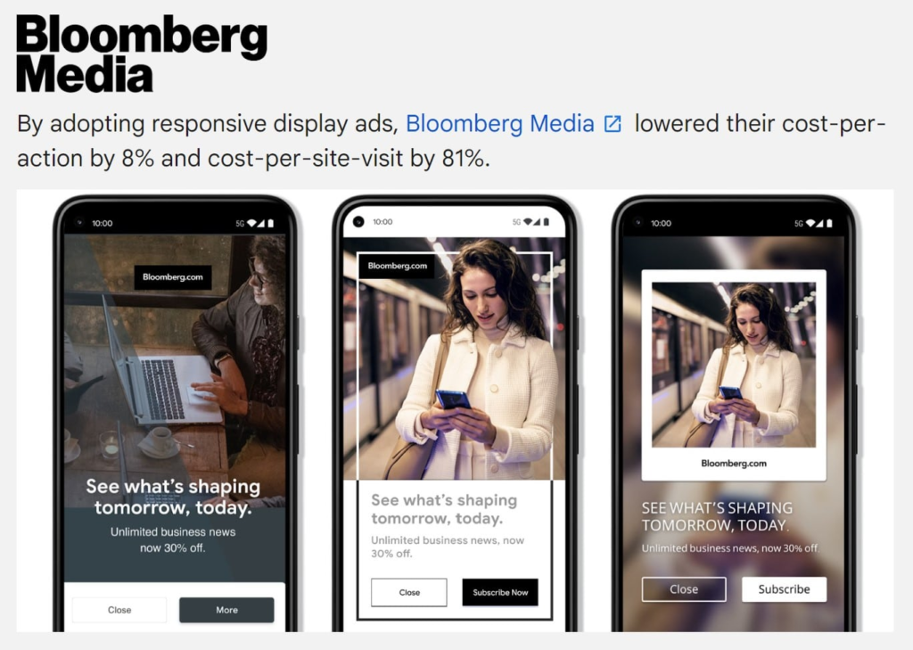
Google ads with the right UX show 67% higher CTR. Advertising creatives from top brands prove that users are 4 times more likely to interact with ads that do not annoy them.

And now the most interesting thing: video creatives with a UX approach have an 85% higher view rate. Why? Because people do not immediately realize that it is an advertisement and watch it to the end.

UX in creatives: why the user experience starts before the ad click

User psychology

Your brain processes visual information in 13 milliseconds. During this time, it manages to understand: “this is familiar” or “this is suspicious”. Targeting creatives that use UX principles fall into the “familiar” category and pass natural attention filters.

UX in creatives: why the user experience starts before the ad click

Platforms dictate the rules: how to adapt UX

Facebook and Instagram: emotional contact

Advertising creatives for Instagram and Facebook have a special specificity. People relax, communicate, and have fun here. Your ad should be “your own in the pack.”

What works:

Photo creatives for Facebook in a vertical format (98.5% of mobile users);
First 1.7 seconds – a hook that stops scrolling;
A visual style that looks friendly;
Natural emotions in the frame (not staged smiles).

An example of a UX approach: Instead of “50% OFF!”, make a “Look what I found in my favorite store” style creo with a video of the product unboxing.

Google Ads: search logic

Google ads work in a completely different way. Here people already intend to buy or learn something. UX is all about maximizing relevance to their request.

The formula for successful Google Ads:

Personalized descriptions work 2 times better;
Images with real people give +30% to the result;
Mobile version is a priority (more than 20% of text on the image can reduce the reach).

Video Creativity Secrets: UX in motion

Video creatives are a separate universe with their own UX rules. You have 3 seconds to get people interested. Not to sell, but simply to keep the person from scrolling on.

UX life hacks:

Dynamic hook (movement, frame change, bright element);
Brand logo from the first frame (not at the end!);
Do not put a super emphasis on sound (60% watch without sound);
Cyclicity for autoplay.

Example: Instead of the classic “Hi, I’m Alexey, and today I’m going to tell you about…”, start with the result: show the product in action, the before/after effect, and people’s reactions.

Technical UX: what the user does not see but feels

Speed is UX

Is your advertising “slowed down”? You’re losing 70% of potential customers. Creatives for targeted advertising must be technically perfect.

Technical UX checklist:

Lossless compression (WebP instead of JPEG);
Adaptive sizes for different devices;
Progressive video loading;
Backup options for slow internet.

Accessibility = bigger audience

64% of consumers are more likely to interact with accessible ads. Basic rules:

Text contrast is at least 4.5:1;
Font size at least 14px;
Alternative text for images;
Consideration of color blindness.

Emotional UX: how creatives influence feelings

Colors guide decisions

Advertising photo and video creatives with the right color work like hypnosis:

Red – urgency, promotions, sales (+ to CTR)
Blue – trust, financial services, B2B (+ to trust)
Green – safety, health, environment (+ to conversions)
Orange – creativity, youth, accessibility

Life hack: Test one creative in different color schemes. You’ll be amazed by the results.

UX analytics: what to look for besides CTR

Forget about CTR as the only indicator of success. Creatives with good UX have other indicators:

What to track:

Time to Engage – how quickly people interact;
View Duration – how long people watch the video;
Scroll Depth – how deeply long posts are scrolled;
Bounce Rate after click – traffic quality.

A practical problem for you: One creative had a CTR of 2%, but a 15% click-through rate. The other one had a CTR of 5% and a conversion rate of 3%. Which one is better? That’s right, the first one. UX in action.

Mistakes that kill UX in creatives

Top 5 ways to ruin everything

  1. Information overload – trying to squeeze the entire presentation into one post;
  2. Ignoring the context – using creative from LinkedIn in TikTok;
  3. Unreadable text – small font, poor contrast;
  4. Blurred CTA – a person does not understand what to do next;
  5. Pad design – creation for a large screen, forgetting about mobile.

How to fix it in 5 minutes

Express audit of your creatives:

Look at the creative from a distance of 2 meters – is the key message visible first?
Look at it on your phone – is it easy to interact with?
Ask others for their opinion on the first 3 seconds – what do they remember?

The future of UX in advertising creatives

Interactivity becomes a standard

The creatives of the future are not static images. AR fitting, 360-degree videos, interactive elements are becoming the norm.

Practical checklist: check your creatives

Quick audit in 10 points

[ps_shortlist]Platform: is the creative adapted to a specific social network?
Speed: does it take less than 3 seconds to load?
Mobility: looks good on the phone
Readability: the most important text is visible at a glance
Context: fits into the user’s feed
CTA: it is clear what to do next
Emotions: evokes the right feelings
Branding: the logo is noticeable, but not intrusive
Uniqueness: stands out among competitors
Testing: there is an A/B test plan

Your action plan for tomorrow

  1. Audit current creatives – evaluate them with a checklist
  2. Competitor analysis – see what works in your niche
  3. Testing UX hypotheses – create 2-3 variants with different approaches
  4. Setting up metrics – track the right metrics

UX in creatives is not a fashion trend, but a harsh realism of modern marketing. While someone else is doing it “at random”, you can create creatives that really work. Because in a world where attention is the most valuable resource.

Start small: take one of your most successful creatives and think about how to make it even more user-friendly, what details to change and test. The result will pleasantly surprise you.

Share your thoughts!

TOP