Don't miss interesting news
You launched an ad, the offer is top-notch, the creatives are catchy — but there’s silence at the exit. Zero conversions, the budget is going down the drain. Sounds familiar?
And you’re already starting to suspect everyone: the affiliate, the advertiser, the algorithms, even Mercury in retrograde. But often the problem is more banal — you’ve led traffic to the wrong place.
Because there are two different “gates” for the user: landing and pre-landing. One immediately pulls you to purchase or register, the other pauses and explains why it’s worth clicking further. And if you mix up the roles of these pages, you can burn the connection before it even has time to earn its first dollar.
In this article, we’ll analyze: what are landing and pre-landing, how do they differ, in which cases do they work, and when do they become a burden. In simple words, with examples and typical fake-ups, so that after reading you no longer confuse the cashier with a consultant in a store.
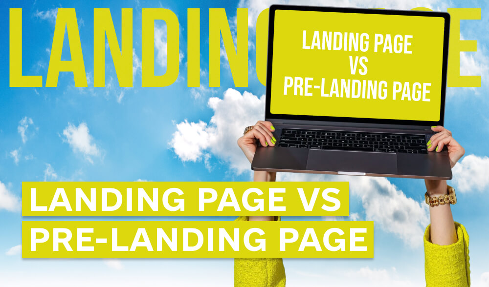
In the world of traffic arbitrage, everything revolves around two pages: landing and pre-landing. And although they are often confused, in fact they perform completely different functions.
Landing page is the final page where the user must take a targeted action: buy a product, leave a request, register or download an application. Everything is as straightforward as possible here: the “Buy” button, a contact form, “Register now”. Landing is the place where the conversion itself takes place.
Pre-landing page is the preparatory stage. An intermediate page that “warms up” the user before he ends up on the landing page. Here you can explain the benefits of the product, answer typical doubts, tell a story or even show reviews. In other words, create the right mood before the final action.
The simplest analogy:
Without a pre-landing, a person may simply walk past because “they are not sure yet”. But with a pre-landing, they will reach the checkout with a much higher probability.
To understand the difference between a landing and a pre-landing, let’s look at a few real scenarios.
You drive traffic directly to the landing page of an online store with sneakers. There is a photo of the product, a “Buy” button and an order form. If the user is already ready to buy (for example, they were looking for these sneakers), they will immediately place an order. In simple niches with hot demand, this works fine.
Imagine that you are advertising a dietary supplement for weight loss. If you drive cold traffic directly to the “Order now” landing page, the result will be weak. But if you make a pre-land in the format of a blog — for example, “How Marina lost 7 kg in a month” with a “before/after” photo and an explanation about the product, the user will receive context, trust and motivation to click further. The “Learn more” button leads to the landing page where the purchase takes place.
For an investment platform, you can use a simple form: “Take the test in 30 seconds and find out if this investment instrument is right for you.” The user takes the quiz, receives the result and the “Register” button. This approach increases engagement and gives a sense of a personalized offer.
In niches like mobile games or apps, preland reviews work: “TOP 3 new games of this month” with a rating and a “Download” button. A person reads about a game in the format of an “independent recommendation” and is more likely to trust the transition to the official landing page.
The logic is simple:
As a result, preland adds one “extra” click, but often this step saves the link from draining the budget.
At first glance, it may seem that landing and prelanding are a trifle: the main thing is to have an offer and creative. But it is the choice and correct construction of the page that often decides whether your link will turn a profit or burn the budget.
Many affiliate programs explicitly state in their rules whether or not to use intermediate pages. For example, in financial offers, a pre-landing is almost always mandatory, but in mobile games or simple subscriptions, it is unnecessary. Be sure to check the terms before launching, otherwise even a good link may not “count”.
A person who sees a product for the first time is rarely ready to click “Buy” without additional explanations. A pre-landing provides context, answers the question “Why do I need this?” and creates an emotional bridge. Therefore, in niches such as medicine, dietary supplements, finance or investments, a pre-landing is mandatory.
If the user has already searched for the product, seen the brand or comes from search queries, an additional pre-landing can even reduce conversion. In this case, no extra steps are needed: the user is already ready to act.
This can be:
It’s important not to just “put up a page”, but to choose a format that suits the niche and audience.
Even the best offer can be buried by a crooked pre-landing: a slow mobile version, stock photos, banal “Buy now” texts.
Remember: the pre-landing should look as native and convincing as possible, because this is where the user makes the decision to click next or close the page.
The same offer with different pre-lands can give completely different results. So don’t stop at one version. Run several versions of the article, quiz, review and see what gives a higher conversion.
Conclusion for a beginner: pre-landing is not an “extra page”, but a tool that can double the conversion or save a link from failure. But it only works when done correctly: with high-quality text, native design and a clear logic of transition to the landing page.
Even experienced arbitrageurs sometimes “knock down” their links at the landing or pre-landing stage. For beginners, this rake is generally a classic. Here are the main mistakes that are better to immediately blacklist.
Trivial, but a fact: beginners sometimes put a pre-landing instead of a landing page and wait for conversions. As a result, the user clicks on all the buttons – and the order or registration form is simply not there. Pre-landing is just a “warm-up,” and the “finale” always happens on the landing page.
When the page looks like an outright deception: fake reviews, clickbait in the style of “doctors in shock,” intrusive pop-ups. Users today are not so naive: instead of trust, such an approach causes disgust and page closure.
Driving cold traffic to a landing page with a financial offer or medical product is the same as trying to sell a car to a person who just came for a loaf of bread. In complex topics without a pre-landing, conversion drops to a minimum.
Many beginners take ready-made pre-lands from publics or spy services and pour traffic into them without adapting them to their geo, product, or audience. The result is absurd: a text about American medicine, and the target is Ukraine. Zero trust, no money either.
Most of the traffic today comes from the phone. If your pre-landing takes 10 seconds to load, and the “Learn more” button slides off the screen, the user won’t even wait for it to load. The ideal pre-landing should look clear on mobile.
Launching one option and waiting for a “miracle” is a typical fake-out. Even a good landing or pre-landing may not work in a specific geo or with a specific traffic source. Without A/B tests, you won’t understand where the problem is: in the page, in the creative, or in the offer itself.
Bottom line: in most cases, a bunch of leads burn out not because of a “bad offer,” but because of a poorly made or incorrectly used landing/pre-landing. And the sooner you learn to distinguish them and configure them correctly, the sooner you will be in the plus.
Landing and pre-landing are not just beautiful pages, but parts of a relationship that should work for the result. To understand whether they really fulfill their function, you need to look not only at the overall profit, but also at specific indicators.
This is the first signal: did the user’s page interest him enough to click further. If the CTR is low, the problem in the pre-landing is the boring text, the button is inconspicuous, or the format did not “get” under the traffic.
The main indicator is whether the final page works. If the pre-landing works well (users move on), but there are no registrations or purchases on the landing, it means that either the offer itself is weak, or the page does not convince to complete the action.
If a user spends a few seconds on a pre-landing and leaves, that’s a red flag. A good pre-landing keeps attention: the article is read, the quiz is passed, the review is watched to the end. The longer a person interacts with the page, the higher the likelihood of conversion.
Evaluate not just the number of clicks or conversions, but how much the resulting lead, purchase, or install actually costs. This shows the effectiveness of the entire relationship together: creative → pre-landing → landing.
The final metric that decides everything. You can have a good CTR and even a good conversion, but if after calculating the costs and profit, you end up with a loss — the relationship is not working. ROI shows whether the whole scheme really makes money or just “looks good.”
Bottom line: there is no “magic” number that guarantees success. All metrics need to be looked at in a complex way: from CTR on the pre-landing to the ROI of the entire connection. And only then can you understand whether the problem is in the offer, in the creative, in the page or in yourself.
To avoid confusion and not burn budgets, keep a simple cheat sheet:
Landing is the final page with an action (purchase, application, registration).
Pre-land is an intermediate “warm-up” that removes doubts and encourages people to click further.
Finance, medicine, new products – without a pre-landing, traffic often simply merges.
If a person is already looking for your product, take them straight to the landing page.
Article, review, quiz, blog review. The format should be selected for the niche and audience.
Don’t confuse landing with pre-landing. Don’t copy other people’s examples without adaptation. Don’t forget about the mobile version.
There is no universal solution. The same offer in different geos can work with completely different pre-lands.
Conclusion: the landing sells, and the pre-landing explains why it’s worth buying. And it is this tandem that often decides whether your bundle will turn a profit or your budget will “burn out” in a flash.