How do you know if a brand looks reliable and not just “pretty”? At a time when every second startup uses AI and creates a logo in three clicks, visual language becomes critical, it either builds trust or instantly destroys it.
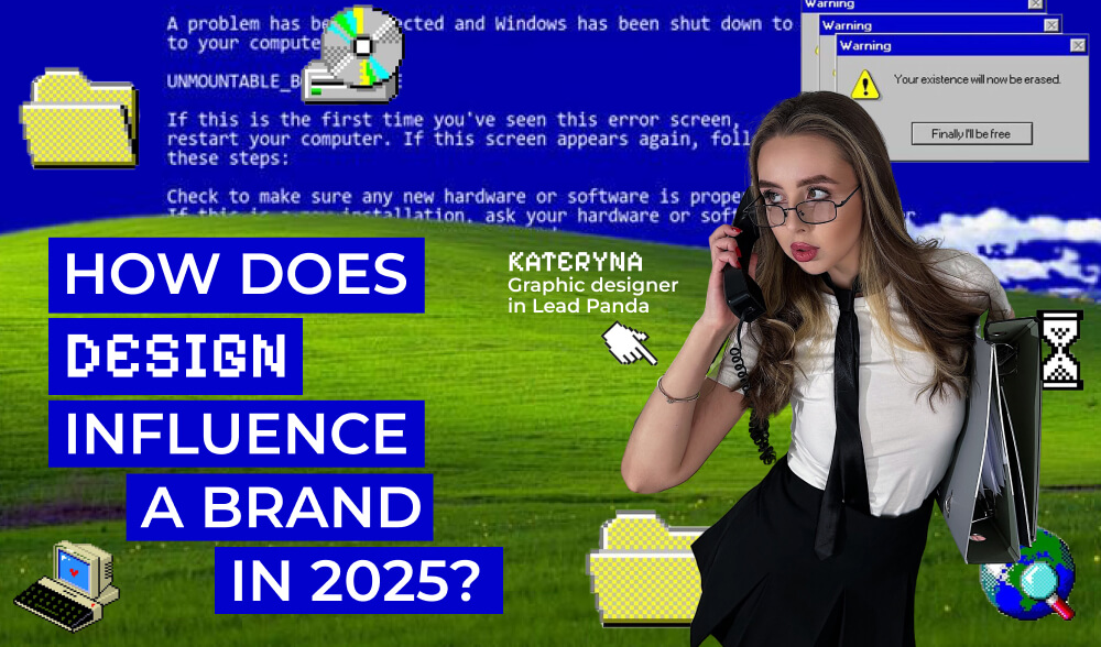
We talked to Kateryna, graphic designer at Lead Panda, about how visual culture has changed in 2025, why minimalism with character works better than “anti-design,” what fonts immediately hint at the level of the brand, and what “trust design” means on the examples of PayPal, Monobank, Uber, and Rhode.
In this conversation, we’ll talk about colors that calm you down, fonts that speak for themselves, and visual patterns that shape the aesthetics of new trust.
Which colors work for reliability today, and which ones, on the contrary, cause a sense of risk?
When it comes to colors associated with reliability or risk, to be honest, everything is very individual. Personally, neon and acidic shades evoke a sense of risk, especially when they are combined with dark colors. In my opinion, such “flashy” palettes should be left in the past and move on to something more restrained and stable. I would also add here too contrasting and bright combinations, because they cut the eye and create tension.
If we talk about colors that work for trust, I would pay attention to calm, clear, “earthy” shades. And one more thing: I would avoid pure black, it’s better to play with its nuances and shades.
But, again, it all depends on the niche, the brand concept, and its tone. There is no single recipe here.
Are there any fonts that automatically make a brand look serious?
Absolutely YES. Too decorative, non-standard, and often fuzzy fonts immediately signal that we are looking at a startup or a brand that does not yet claim to be of a high level.
I prefer the classics and almost never use something too unconventional, unless a specific task requires it. There are many variations of grotesque and antique fonts in the world, but we stubbornly choose overly decorative fonts for branding.
What visual patterns do people perceive as modern nowadays and which ones look “old school”?
I would say that modern visual patterns include “cleanliness”, when there is more air, space in the layout, minimalism with character.
As for those that look outdated, I would say attempts to create “anti-design” that eventually turn into chaos: a mixture of fonts, colors, stock images, and overly intrusive AI.
What are the most common design mistakes that often push users away from a product?
Most often, users are put off by visual noise, lack of consistency, artificiality, sloppiness, and overabundance of emotionless AI.
What are some examples of brands with “trust design” that inspire you?
I am inspired by several examples of brands with “trust design”.